First, we want to be clear: we are huge fans of Airbnb. Love the site. Love the various renting errr 'sharing' experiences we've had over the past few years on the platform. We've been a part of the airbnb "community" for the better of 3 years now, as hosts of our own properties, travelers to others' and managers of airbnb properties of our clients.
We quoted the word community above because that word was so heavily promoted in the recent webcast we were invited to attend which is also where founders Brian, Joe and Nathan (and sitting awkwardly next to them for the better part of the 20 minute webcast, their first 'guest' from 2007) decided to tell us of the company's entire rebranding effort, in both its messaging, its logo and its booking platform.
We have a few issues with the messaging and the logo but the majority of our issues lie in the new platform design.
The Logo and the New Airbnb Message
![]()
The new logo is a 'belo' and if you indulge us, we'll try to summarize the thinking behind it as delivered from founder Brian Chesky: "it encapsulates the entire airbnb community experience which is about belonging and sharing and really turning this world into one where we pay for things into one where anyone can walk into anyone else's special place, that we call a house and share a hug and take a picture together and in that moment create a home. A home that we would like to call a belo home. A place where strangers from opposite ends of the universe can co-exist in harmony and no one feels left out. When you see the belo, wherever you are, you know you belong."
What? Are you serious Brian?
A company that gets a 10 billion dollar valuation (surpassing some of the most well known hotel brands in the world by the way) on its most recent cap raise that tries to appear even more organic than they already did before by way of not doing such things like announcing a rebranding effort, loses it's authenticity for us. The old logo was fine in our opinion, you could've even cut out the 'irbnb' and just left the 'a'. We like the color scheme better and as the entire twitter-verse already pointed out, it's not as sexual in over or undertone.
Our grade: 6/10.
![]()
The New Platform
The major problem we have with the rebranding is neither the logo or the message, it's actually in the site design. Like paypal before it (and hundreds of other slick websites) the new airbnb desktop site offers a video feed along the main quadrant of the home page. Which in theory can be cool. Paypal has a video on a loop of a trendy coffee shop making an espresso or americano, whatever doesn't matter. Airbnb however which previously pushed static photos of some of the coolest spaces and homes you could find on their site decided to take it a step further. They pushed in video of people, the "community" experiencing the airbnb.....experience. Which if you haven't seen it at this point probably seems like something that would build on the images and essentially make them go live, right? Wrong.
Instead you get to watch people fake-sleeping in bed. On what feels like a voyeuristic live video feed. Which is totally awkward and not at all native to the airbnb experience. (Editors note: there are other types of live action experiences happening which do not involve sleeping actors). It's the other live video experiences that airbnb should be promoting. The sleeping part is weird, everyone is alone (which if you're going to feature the city of Paris (which they do) then you know no one is sleeping, and certainly not sleeping alone).
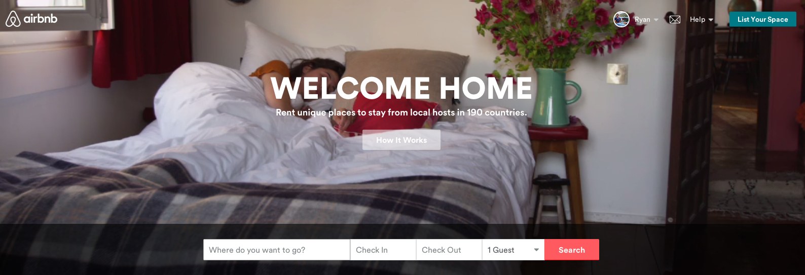
Our grade: 3/10
We're still big fans of airbnb, but we just prefer the old platform and logo. We didn't need the founders telling us how to think about airbnb because we already thought of them and the site that way. All of this just reminds us of that friend we all have that touts their 'giving back' and 'doing this for the kids' charity endeavors but in reality is just posting pictures to Facebook of their walk down the red-carpet at whatever event is benefitting whatever charity of the month. It's transparent and it's unnecessary.